Skip to content

Ghost in the Machine

Haunting the Web Since 1999

Ghost in the Machine

Still the Blue and Orange.

“The idea was to mix two sports and redesign their logos. Being a fan of both football (or soccer) and basketball, I decided to redesign NBA logos and make them look like football logos. Every logo you see is color correct and matches the idea of the original logo.” 
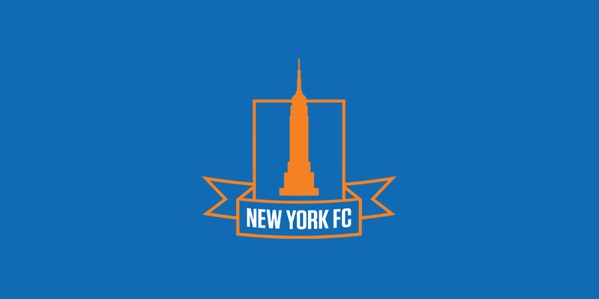
Making the rounds of late: NBA logos, football-style.

Author KcMPosted on January 28, 2014January 28, 2014Categories Art, Knicks, NBA, SportsTags Advertising, Knicks, NBA, Soccer, Sports

Post navigation

Previous Previous post: 2013 in Film.
Next Next post: Dirty Henry.

KcM Links

Kevin C. Murphy.com | E-mail | Short Biography | GitM Archives | Old GitM ('99-'02) | Blogroll | Movie Reviews | On Progressivism | Pics of Me | Writings by Me | US History Orals | Dissertation

Recent Posts

  • Lowry? Has Anybody Seen SAM LOWRY?
  • Turn the Machine Back On!
  • Murfday 2017.
  • The Return.
  • 2016 in Film.

Omsbudsdog Emeritus


Berkeley, 2000-2014.

Social Media Intern Emeritus


Murf, 2008-2024.

Uphill All the Way

Syndicate this site:
RSS 1.0 | Atom (2.0)

Unless otherwise specified, the opinions expressed here are those of the author (me), and me alone.

All header images intended as homage. Please contact me if you want one taken down.

GitM is and has always been ad-free. Tips are appreciated if the feeling strikes.

Ghost in the Machine Proudly powered by WordPress