City of Circles.

“I could get Lower Manhattan nice and compact, emphasising the close proximity of the stations, but at the same time the rest of the map could breathe…that fan effect might be wrong geographically, but it gives me a lovely spacious and balanced design, where good use is made of all the space.”

After crafting a similar look for London, cognitive psychologist and map enthusiast reimagines the New York City subway system in circles. “Rather than emphasize straight lines, clean angles, and geographical accuracy, Roberts’ maps embody a more nuanced approach to mapping, one that combines aesthetics with usability.” Well, it looks nice…but I’m quite fond of “geographical accuracy” in maps as well.

America By Coach.

“You may have heard that the highest-paid employee in each state is usually the football coach at the largest state school. This is actually a gross mischaracterization: Sometimes it is the basketball coach.”

Deadspin’s Reuben Fischer-Baum conjures up a map of the highest-paid public employee in each state, and, yes, it’s usually a coach. By way of comparison, the college players actually bringing in all the revenue get…nada.

The Expanding Nation.

“This shows the percentages of the U.S. population medically defined as obese, which means a body mass index of 30 or greater…By now everyone knows obesity is a serious issue, but it always helps me to see things moving and in color, and makes the ‘epidemic’ terminology make sense.

A troubling GIF captures twenty-five years of expanding waistlines in America. “Meanwhile, through 2012, no state has met the CDC’s nationwide goal to reduce obesity to 15 percent.” Update: The states behind the curve? Everyone could be lying.

Plancking the Universe | AMS Activate.

“In a statement issued by the European Space Agency, Jean-Jacques Dordain, its director general, said, ‘The extraordinary quality of Planck’s portrait of the infant universe allows us to peel back its layers to the very foundations, revealing that our blueprint of the cosmos is far from complete.'”

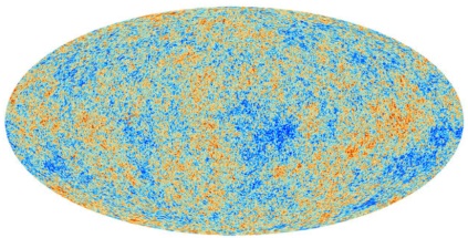
This came out while I was in Seattle and I’ve been meaning to catch up: By measuring the cosmic background radiation still extant from the Big Bang, the ESA’s Planck satellite gives us our most detailed map of the universe yet.

“[T]he new satellite data underscored the existence of puzzling anomalies that may yet lead theorists back to the drawing board. The universe appears to be slightly lumpier, with bigger and more hot and cold spots in the northern half of the sky as seen from Earth than toward the south, for example. And there is a large, unexplained cool spot in the northern hemisphere.”

I find these maps particularly fascinating because, as I said when NASA’s WMAP returned its data in 2003 (and here in 2002), I spent the summer of 1992 poring over the original COBE DMR version of this map for my high school senior thesis, in order to determine whether the radiation exhibited a fractal distribution. (And, honestly, how early 90’s is that?)

“‘A.M.S. has confirmed with exquisite precision and to high energy one of the most exciting mysteries in astrophysics and particle physics,’ said Justin Vandenbroucke, of the University of Wisconsin and Stanford’s SLAC National Accelerator Laboratory.” In related news, NASA’s recently-installed Alpha Magnetic Spectrometer on the ISS is helping physicists and cosmologists get to the bottom of the dark matter mystery.

The A.M.S. has “confirmed previous reports that local interstellar space is crackling with an unexplained abundance of high energy particles, especially positrons, the antimatter version of the familiar electrons that constitute electricity and chemistry…’Over the coming months, A.M.S. will be able to tell us conclusively whether these positrons are a signal for dark matter, or whether they have some other origin.’

From Mendocino to the New York Island…

“The fundamental problem of the electoral college is that the states of the United States are too disparate in size and influence. The largest state is 66 times as populous as the smallest and has 18 times as many electoral votes…To remedy this issue, the Electoral Reform Map redivides the fifty United States into 50 states of equal population.”

A lot of people may dream of a new America, but artist Neil Freeman has actually drawn one up, with the aid of some number-crunching algorithms. “Keep in mind that this is an art project, not a serious proposal, so take it easy with the emails about the sacred soil of Texas.”

We’re No. 50!

On the eve of the State of the Union — Win the Future! — the wags at Pleated Jeans compile a handy map of what each state desperately needs to work on. (By way of Blackpepper and Webgoddess.) “Whether it’s a fat population, high rate of STDs or excessive tax rate, it turns out that every state ranks dead last in at least one unsavory category. Check out the map (click image to enlarge) to see what your state is the worst at, then review additional stats and references after the jump.

Everything’s Bigger in Texas.


The westward movement of the U.S. population means six districts in states that went for Obama will shift to states that went for McCain — a small but significant shift that could help a GOP presidential candidate in 2012, provided they can hold those states for the party.

The US Census Bureau announces the newly-reapportioned electoral map for 2010, and it shows electoral gains for (blue areas in) red states and the Northeast and Midwest diminishing (in growth rate, at least. The only state to actually lose people was Michigan.) Since the GOP will by and large control the redistricting process in most states, this is further bad news for Dems in the short term. Nonetheless, the overall demographic trends are still working in our favor.

In related news, Robert Cruickshank makes the modest proposal of removing the 435-member cap on the House, first passed in 1929. “In the 1930 Census, which found a population of just over 122 million, this produced 435 House districts of about 282,000 each. By 2012, however, a US House district in a state with more than 1 seat will represent about 708,000 people. That’s an increase of 2260% from 1790.

All Your Base Are Belong to Us.

Here’s another very good reason why it’s time to stop catering to conservatives in Washington: As anticipated by Dubya’s approval rating circa 2005, America — notwithstanding Mormon country — seems to have given up completely on the GOP. “The results, depicted in the map above, show that only five states have a statistically significant majority of voters who identify themselves as Republicans.” Five states…the Federalists and the Whigs had a better showing than that.