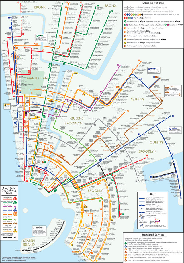
After crafting a similar look for London, cognitive psychologist and map enthusiast reimagines the New York City subway system in circles. “Rather than emphasize straight lines, clean angles, and geographical accuracy, Roberts’ maps embody a more nuanced approach to mapping, one that combines aesthetics with usability.” Well, it looks nice…but I’m quite fond of “geographical accuracy” in maps as well.